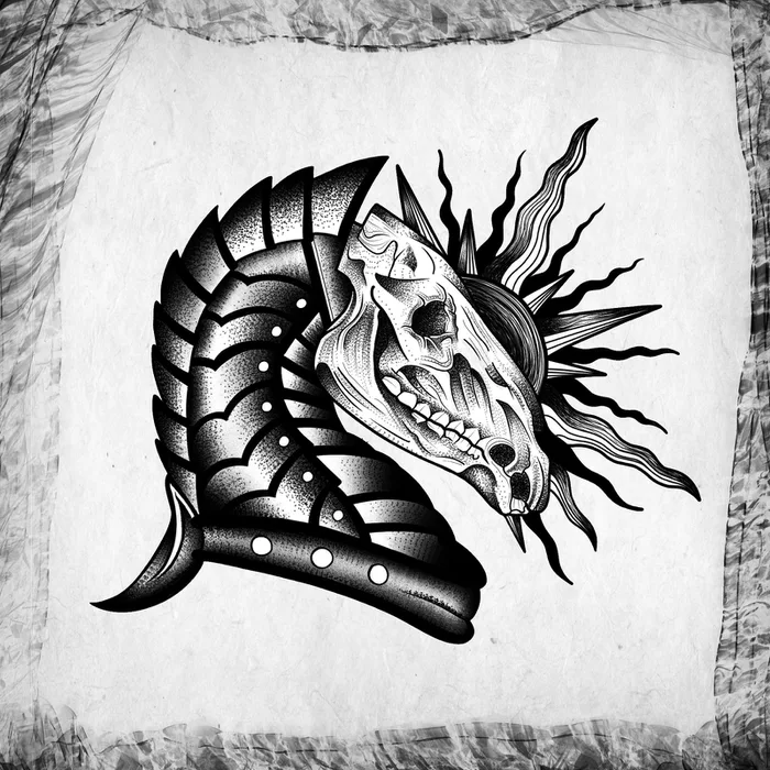
I'd make that sun way larger and maybe add horns or something like it - but overall a great idea and pretty decent technique. You should definitely keep going!
The art and the composition is really good, but there is one problem with it. The armor has too much contrast in it compared to the skull. It won't be readable enough on skin
I like it! Would translate well to a tattoo with that style. Really like dark solid black in tattoos. Make sure you do some fine line drawings to and work on keeping steady. Most important thing is being able to pull a clean line
First at all learn about basic rules of composition.
Rembertów that less means more. There is a lot of unnecesary things on this drawing. Shapes aren very poorly tought, like why back off the armor is pointy and front is rounded in sausagey way. You can't just doodle domek random shapes into one. Over all it's kinda bad.


Mary Kate McFarlane Brennan
Choze Young
Chompink Sunshine
Mary Cox Morris
Maryam D Bello
Lindsay Henderson
Jess Alderwood
Walt Cosby